People have been saying that ‘the year of the mobile’ has been here for a while, it now seems as if Google are forcing that issue.
On February the 26th 2015, Google announced on their webmaster central blog that they will be adapting their algorithm to reflect the changing behaviour of their users. This change will see those websites that are mobile-optimised receive a small boost, versus those websites that do not provide a mobile-optimised experience.
[We] will be expanding our use of mobile-friendliness as a ranking signal. This change will affect mobile searches in all languages worldwide and will have a significant impact in our search results. – Google
Google have provided further information and some handy tools allowing you to determine whether your website is mobile-friendly or not, which I have provided below:
- Google’ guide for mobile-friendly websites
- you can test a few pages with this tool
- or you can use Webmaster tools Mobile Usability report to see whether Google think your website is mobile-friendly
To my knowledge, Google have never before provided an exact timetable for algorithm releases, but this time they have. D-day for those that have not got a mobile-friendly website is 21st April 2015.
With that in mind, I wanted to see how a selection of the UK’s biggest brands are performing when it comes to being mobile-optimised, and whether they will be affected based on the upcoming algorithm change.
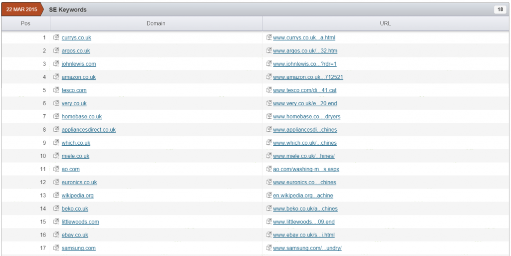
I have used SEMrush to find the top 20 websites for the following search terms:
Note: If you want to skip to a certain industry, use the anchor links above.
Note about test: I checked each website on a mobile device first by searching for their brand name in Google UK. I then used the URL provided and ran it through Google’s tool, to test whether they see it as being mobile-friendly. Some of the URLs within the screenshots taken from SEMrush are not the mobile versions. All information used has been gathered with publicly available information. I am not affiliated to any of the brands mentioned.
38% of those brands checked for the term “holidays” are not mobile-optimised
For the term holidays, I checked the following brands based on the results shown by SEMrush.
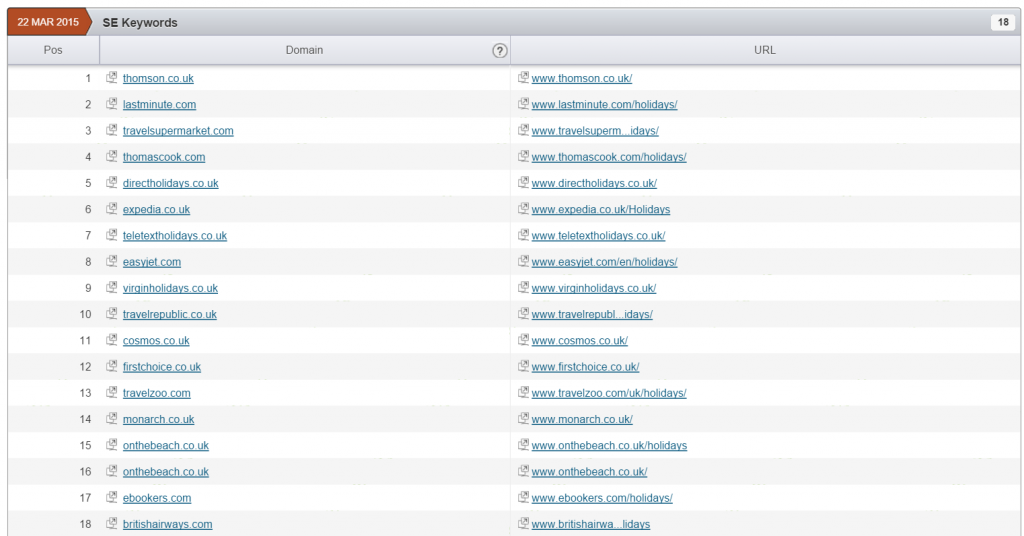
Of the 18 travel websites checked, 7 failed with either the website not being optimised for mobile or a technical issue. With an ever increasing number of travel bookings in the UK being made on a mobile device, the number of brands that have failed this simple test is incredibly high.
Those brands failing to provide a working mobile-friendly website include a mixture of package holiday providers and airlines:
- Thomas Cook
- Travel Republic
- Cosmos
- Virgin Holidays
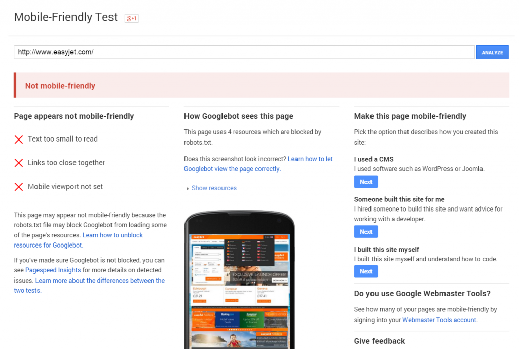
- EasyJet
- Monarch
[Tweet “38% of those brands checked for the term ‘holidays’ are not mobile optimised – http://bit.ly/1JbvhFC – via @danielbianchini”]
Thomas Cook fail on technical issues
Of the seven websites that failed Google’s mobile-friendly test, it was only Thomas Cook that failed due to the configuration of their Robots.txt file. When running the test, the result indicated that the requested URL is being redirected, but the redirected URL is being blocked within the Robots.txt file.
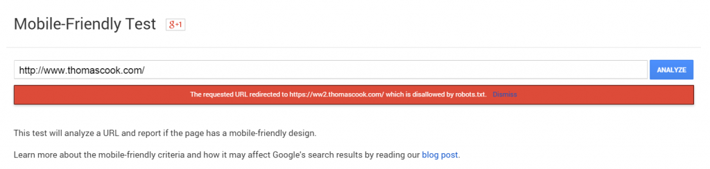
This is reflected within the serach results, where there is no mention of the website being mobile-friendly, even though when you click through to the website, you are provided with a mobile-optimised website.
Are these brands prepared to fall?
Six brands (yes, six brands!) do not have a mobile-optimised website, and these are not small brands within the travel sector. Two of those brands, Cosmos and Monarch, provided a list of links to the user, whilst Travel Republic, Virgin Holidays, Direct Holidays and EasyJet merely display their desktop-optimised website, providing a terrible user experience when visiting from a mobile device.
It’s going to be interesting to see whether these brands will be quickly optimising their mobile presence, or whether they continue to provide a sub-standard mobile experience to their users.
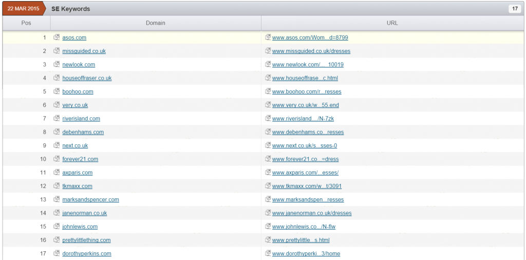
4 out of the 17 retail websites checked for the search term ‘Dresses’ are not mobile-friendly
The retail sector is another industry where the customers are extremely tech savvy, and are one of the most advanced set of users when it comes to purchasing on different devices. So imagine my surprise that 4 out of the 17 websites checked were not classed as mobile-friendly, and even more surprising was the brands that are failing.
[Tweet “23% of retail brands checked for the search term ‘dresses’ are not mobile optimised – http://bit.ly/1JbvhFC – via @danielbianchini”]
Fashionable since 1982, but not ready for 21.04.15
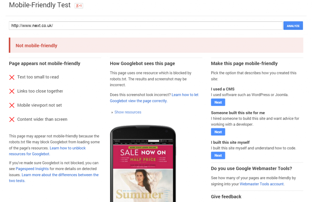
Arguably one of the most popular high street retailers, NEXT currently do not have a mobile-friendly wesbite, instead opting to provide their users with the desktop version.
With millions of users browsing and/or purchasing products on their commute, at lunch time or just generally on the go, it is hugely surprising that NEXT are still to implement a mobile-friendly website.
Millions on TV Adverts, but how much will a Robots.txt file cost them
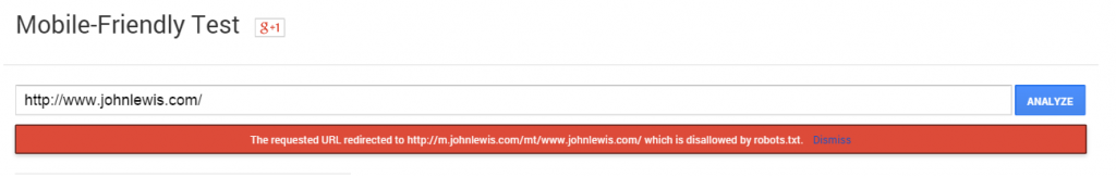
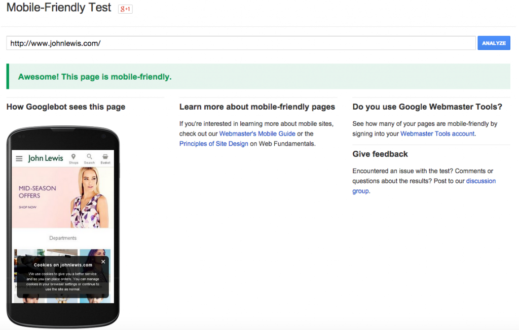
It is reported that John Lewis spent £7million on their latest Christmas campaign, yet a small technical issue could potentially cost them a lot more if it is not fixed quickly.
When visiting the John Lewis website on a mobile device, you are presented with a mobile-friendly website with a decent user experience. However, when testing the website with Google’s mobile tool it fails, suggesting that the Robots.txt file is the main issue.
This is represented in the screenshot below, but when you search for John Lewis on a mobile device you are presented with the folllowing description “A description for this result is not available because of this site’s robots.txt – learn more”.
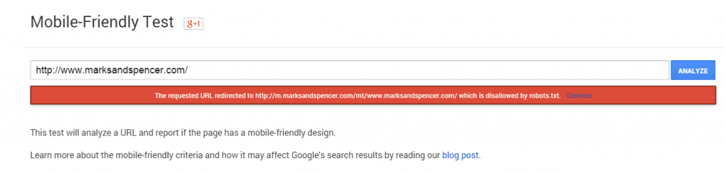
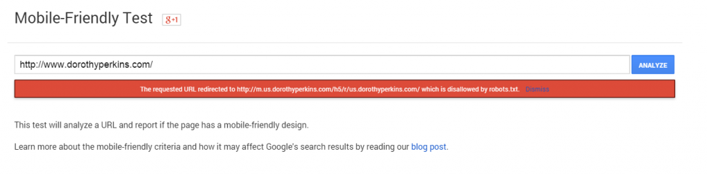
John Lewis is not the only large retailer that is suffering from this issue. Marks & Spencer and Dorothy Perkins are both suffering from the same issue as shown in the screenshots below.
The tool suggests that the issue is with the Robots.txt file, but do those at John Lewis, Marks & Spencer or Dorothy Perkins know about it, and do they care? With the size of these retailers, you would expect them to have people checking this, especially with the announcement made back in February. Maybe they are making the changes as we speak, but they are leaving it awfully late to get this implemented.
[Tweet “Google’s mobile algo goes live 21.04.15 but @dorothy_perkins & @NEXTofficial are not ready! – via @danielbianchini“]
[UPDATE – 09/04/15] – Today I was tweeted at by @screamingfrog mentioning that JohnLewis had changed their robots.txt file to allow their website to become mobile-friendly in the eyes of Google.

On that news, I ran the test and it did indeed pass, showing that no matter how big the company you can still be agile and get things done quickly! Good work JL team!!
[END OF UPDATE]
Are all Insurance brands fully comprehensive?
The insurance market in the UK is one of the most competitive in search and being on the first page, let alone in the top three, is a must have for most insurers.
With car insurance prices generally increasing year on year, most people are looking for the next great deal, with mobile traffic and conversions rising sharply.

4 of the 19 brands checked do not have a mobile website!
As expected, all of the insurance aggregators in the first two pages have a mobile-friendly website, whilst the majority of insurers such as Aviva, LV and MORE THAN are also ready.
There are four websites that are not mobile-friendly, three insurers and one information provider:
- Money Saving Expert
- Admiral
- Swift
- RAC
Depending on the effect the algorithm will have on the mobile search results, RAC and Admiral will potentially see the biggest impact, based on them currently ranking 9 and 10 respectively.
[Tweet “4 of the 19 brands checked for the search term ‘Car Insurance’ don’t have a mobile website! – http://bit.ly/1JbvhFC – via @danielbianchini”]
Those UK brands that sell ‘white goods’ are the most mobile-friendly sector
The brands that sell ‘white goods’ in the UK are some of the most diverse companies you will see, with a cross section of manufacturers, electrical retailers, supermarkets, pure play businesses and department stores.
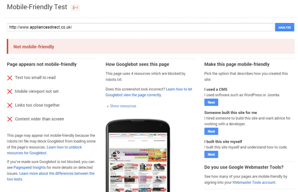
When searching for the term “washing machines”, there were only two websites that did not provide a mobile-friendly experience to the user, and these were:
- Appliances Direct
- Miele
Both brands are currently showing the desktop version of their website to mobile users.
[Tweet “25% of the UK biggest brands fail Google’s mobile-friendly test! – http://bit.ly/1JbvhFC – via @danielbianchini”]
The issues that have been highlighted above are ones that can be changed, and in some cases very quickly. But do these brands think mobile is the right direction for them?
My view is that we should not be thinking about mobile vs desktop, we should be thinking of the user. Once we are thinking about the user then we will ensure that their user experience, no matter what device they are using, is optimal.
I am interested to see how these brands react to the upcoming algorithm change. Will they rush it through before the deadline? Will they take the hit, and see what effect it has on business? Will that be too late? I would love to hear your thoughts on above in the comments below, or over on twitter @danielbianchini.
[Update – 07/04/2015] – Since posting I have come across two pieces of content that are essential reads for ensuring that you do all you can to help get your website ready for 21st April 2015
Hi Dan – as an FYI there are quite a few brands you have mentioned within the post that are fully aware of the robots.txt issue however the mobile platform they are using have been slow to react and some cases really do not care. It will be a case of those SEO’s that manage the accounts being unfairly blamed and a scape goat. One of the brands listed were warned over 12 months ago.
It is going to be interesting to see if Google will be lenient to those sites that have misconfigured their mobile websites.
Hello Carl,
Thanks for the comment. Just to let everyone know this is not an attack on Webmasters, Platforms or SEOs. The idea of this post came from me being interested in who was ready. I appreciate that people internally may are already aware of the issues, and I mention this in the post. I also appreciate that those in charge of development have to go through release cycles, and in some cases this can take a long time, however as a digital industry, we have been talking about mobile for years, and I would have thought most, especially those in the more advanced sectors would be ready.
What really needs to be looked at is the impact mobile traffic has on these brands’ sites – if their business really depends on mobile traffic then indeed they’re heading for a disaster, if mobile traffic is just a small addition not critical for conversions and it would cost more to fix things than the benefit would be then why bother. Plus, let’s not forget this is enterprise SEO = lots of politics and trying to get across to decision makers
Hello IrishWonder,
Absolutely, and if it was a more service based website, say “pensions” and your mobile traffic is minimal then it may not be necessary, but I picked brands that through experience have a high percentage of mobile traffic, with conversions growing daily.
I also agree that there is a lot of red tape, but as Carl mentioned in his commment above some brands were told over a year ago this was coming. But even if they weren’t kept in the loop, they should be thinking about the experience of their customers on mobile devices.
Thanks for the comment, and tweet. 🙂
Misconfiguration is not misconfiguration and done on purpose or for another reason which you would not be aware of so I think before calling out sites in general you should in all honesty make sure your facts correct first in addition 35% of booking for travel products are made on mobile it total rubbish and a duff stat that might be the case for cheaper products like flight or hotel only but certainly isn’t true for package holidays
it’s worth noting that when you do a Google search for ‘Thomas Cook’ (on Android), there is an organic listing for their mobile site, which is deemed by google to be ‘mobile friendly’.
so, it may well be the case that having their non-mobile site de ranked for mobile returns will be a win for them, their customers and google. Same with EJ – sure they’d prefer people to download their app.
also plucking one at random – it’s interesting that an (android) mobile search for money saving expert, google deems their site to be mobile friendly.
I think this is where it will all get confusing, as they seem to be building a completely new mobile index. I just checked on my nexus and both TC and MSE websites comes up without the mobile friendly tag and when running it through the tool it also says its not mobile friendly. I don’t want to get caught up on a specific brand as this is just a snapshot of what saw.
Forgive me Dan, I just skim read the article, but someone like Easyjet for example 100% DOES have a mobile optimised website, so why are you saying they don’t? Or do you mean these mobile sites are not accessible via the Google SERPs?
Hello Jamil. As mentioned In the post, it is based on the up coming algorithm update affecting the mobile SERPs.
I like this post. I think that Google is just sh** scared of losing revenue of ads on non responsive websites.
I also think calling out a few brands is a good thing as most of the agencies they have as their dugital strategists clearly understand little. And yeah tracel might not convert on mobile but that is no reason to not have a mobile experience!
daniel sorry mate but you have no idea on tc seo nor the strategy or tech involved and why etc. if you had been polite enough to ask before you posted this guff I may have been happy to give some clarity
Hello Karen,
Thanks for the comments, appreciate the time you have taken and I wanted to respond.
Firstly with regards to this post being “guff”, that is a matter of opinion and I appreciate that. But all I have done here is used the tools that Google have provided to determine whether a website is mobile-friendly. If however, you can say that by running a search in Google on your mobile device, you see a tag suggesting that the wesbite is ‘Mobile-friendly’ or you run it through the tool provided and it doesn’t say that the Robots.txt file is blocking the redirected URL that’s great. But as of this morning that is not the case.
I am sure that there is a very good reason for this, and this post is not targeted at your brand. It just so happens that it was within the SERPs that I randomly checked, but it seems that you have taken this personally against either yourself or the brand, which it wasn’t intended. The purpose of the post was to see who may be affected from the upcoming algorithm update using publicly available information and the tools provided and unfortunately it came up alongside 16 other websites.
It seems like you have been unfairly treated in some of the comments above by people who have taken your commentary on their websites’ mobile readiness personally. From where I’m standing you have provided a perfectly balanced view of a couple of really competitive markets.
Thanks James, appreciate the comment. 🙂
Wow, Karen your comment does you no favours and is unnecessarily rude. There are ways to disagree and yours is entirely unprofessional.
This blog simply outlines how major sites fare in terms of the recently announced Google update on mobile friendliness.
Now i’m not saying that strategy has to be determined based on what Google says, far from it, but it’s important for websites to understand the potential negative impact in mobile SERPs if their indexed site/pages aren’t considered mobile friendly by the great Google god monster.
Currently the TC site fails this test. There may well be a good reason behind this and plan to address but as of now the site is publicly not mobile friendly for Google’s SERPs. I just double checked and the robots.txt is still blocking the ww2 URL and the meta description showing in Google’s mobile SERPs says “A description for this result is not available because of the site’s robots.txt”
So instead of being defensive and dismissive, it would be far better to share your knowledge and insights to help inform people.
thanks
james
Why are so many “mobile-friendly” re-designs so DREADFUL on desktops?
How many Users want to do a serious or complex task on a tiny screen?
The advantage of a Desktop for shopping is that items can be compared side-by-side – in separate windows. Pictures can be enlarged.
Re-designed sites:
– Force Users to scroll unnecessarily – AND uncertainly (how long is each page??)
– Font and line-spacing is often over-large – so using the browser to zoom out to 75% or 80% just to see more content.
– Navigation is harder becuase visual clues have been dropped. i.e. instead of rounded and shaded tabs and buttons, we get monotone slabs
– Active and passive text are often not distinguishable – esf. if idnetical fonts are used.
– Monotone, flat icons, ambiguous or menaingless – even worse when uniformly grey !
If this minimalism is really necessary for a Mobile site, then so be it – but on a Desktop it looks dumbed down, saying “we can’t be bothered about the UX”.
A great article and more important than ever now that mobile smartphones are the preferred browsing choice. In fact mobile searches are now more popular than desktop in over 10 countries (including USA and UK). Futher to this the Google Mobile update means that websites which are not mobile-friendly can be penalised on mobile search results pages. I recently carried out a study of 20 of the UK’s most popular independent travel agencies and tour operators and found that 35% of their websites were not mobile-friendly… https://www.linkedin.com/pulse/how-mobile-friendly-uk-travel-industry-daniel-sykes